Categories
data science my projects research

Husband and wife: analysing gender issues through literary big data

Some time ago a friend made me realise the peculiar distribution of the word gay in English literature: relatively common in the 1800s, then in decline, then in massive recovery after the 1970s. Of course, the word here is used with two different meanings, the first one (“light-hearted, care free”) more common in the past few centuries, with the second (“homosexual”) going mainstream in the latter part of the 20th century. All of this can be easily visualised using Google Ngrams.

I became rather curious about this because I realised that gender issues have often been written about in literature; also, the ways in which familiar scenes have been depicted could easily be a proxy to understanding the relationship between the genders, especially in their strict, unchanging view often purported by traditionalists in our society.

So I charted four words: manwoman, husbandwife. The result is enlightening.

You see, it’s not just that “man” dominates. This can be explained in many ways, especially by the common use of “man” as a synonym of “human being”. The sudden growth in the latter part of 1700 is pointing to several phenomena happening in those years, from Enlightenment to the French Revolution.

Some data points:

  • “husband” is rarely used, compared with “man”; the ratio is about 1 to 10
  • conversely, “woman” and “wife” follow a similar trend with a much smaller ratio
  • “wife” has been used more than “woman” until the late 1800
  • “woman” becomes increasingly more important than “wife” after the 1970s.

Isn’t that a rather accurate description of what happens not just in the English literary corpus but, more widely, in society?

Categories
my projects

2013 wrap-up

I like to pretend I have this tradition of doing a year-end blog on 31st December listing some of the best things happened in my life as a techie. This year, I’d just like to list a couple of highlights. Here you go:

  • last February I re-launched, for the third year in a row, my Live Rugby app. Differently from the previous versions, it was without Opta data. As Opta data didn’t really help with user acquisition (I’m not blaming them – rather the way I packed the data) I decided to invest in my own time and delivered a free app with my live commentary to the matches. Results: over 10,000 downloads, once again some great coverage on the press, and at one point the app was more popular than the official one, reaching #13 on the App Store, and bringing some revenue via ads;
  • meanwhile, I kept working  on data.sgul.ac.uk, my “day job’s” Linked Open Data portal which I launched in the first half of 2013. A project that started last year with some lack of interest – if not open opposition – was finally welcomed as a way to deliver FOI requests and increase transparency;
  • I took part to a research project investigating death rates in the Hospital Episodes Statistics dataset, helping with the geographical analysis, and co-authored a research paper which was published on PLOS One; I also co-authored a paper about geographical reporting tools for international cooperation, presented at FOSS4G;
  • partially as a result of data.sgul.ac.uk and in recognition of my experience with data-related projects, I was appointed to Cabinet Office’s Open Data User Group in September;
  • after some months of market research and trials, I helped Italian indie comic publisher develop and launch their digital books distribution platform, Digitail. I became CTO of Digitail last December;
  • I was a judge at Young Rewired State and at the Big Bang Fair this year. Both experiences really got me enthusiastic about the future in tech and science, there are so many talented young people around!

Many of these projects will be continued in 2014. What I’d love to add to the table:

  • cheese-making: despite some success making mozzarella, I’d still like to get more experience and share it; stay tuned!
  • photography: I’m starting to find some assignments to take professional portraits. Let’s see how it goes.
  • more apps: starting from Digitail, of course.

Hence, I’m really looking forward to the new year and its challenges 🙂

Categories
gov hackday my projects open data Work in IT

chaMPion

I never thought hackdays could be so much fun that I would end up attending not just one but two in about ten days, getting flu in between. Oh, and that my team would end up winning the overall Best in show award over 27 other hacks and almost 100 people! Which is what this blog post is about…

First of all: credit where credit is due

The folks from Rewired State deserve a massive thank you for setting up such events, and for showing me that no matter the age and background of the people you work with there is room for great results bacause geeks more than often work well together, in teams, despite what stereotypes like to say.

ChaMPion: what is it?

The idea behind chaMPion is rather simple: you want to find MPs who care about what you care. Often their “declared interests” are not particularly meaningful or up to date, so we decided we would mine the content of their speeches.

ChaMPion is a tool that allows the user to enter a given topic and returns a list of MPs who have spoken about that topic, ranked by relevance.

How does it work?

In easy steps:

  1. we downloaded the extract of the Commons debates for all the sessions of Parliament since the first sitting in May 2010 following the General Election to the latest in November 2012
  2. we parsed these extract and aggregated the speeches by MP – as a result we obtained a map associating any given MP to all of his or her speeches
  3. for each MP we run an algorithm that calculates their keywords distribution; specifically we used Topia.Termextract which, given a text, determines its important terms and their strength
  4. we calculated a ratio for each word over the total of terms extracted for that MP and used this as a basis for our rank
  5. we built an API that searches by keyword and a captivating UI that displays the results graphically, together with other data for the MP and his or her constituency harvested from other sources.

Did you find anything interesting?

Yes! For example, if you search for phone the winner is Tom Watson; if you search for rape, it’s Caroline Flint.

Why didn’t you use X, Y, Z?

YES, you are right, this is not perfect, but it was meant to be just a quick hack that received much more interest than we were anticipating 🙂

For example, using Topia.Termextractor was not my first choice. For a semantic analysis of this kind a beautiful mathematical tool called Latent Dirichlet Allocation (LDA) is generally the natural choice. LDA runs a statistical analysis over a corpus of text, assuming that a document is about a collection of topics. It then returns the distribution of such topics. It’s not difficult to understand. For example, it might say that a speech by Tom Watson is 30% about phones, 30% about news and 40% about crime.

Unfortunately, I didn’t manage to find a library for LDA that worked on my laptop.

Will you keep developing it?

Given we received some pretty heart-warming feedback the answer is yes. For example, I’m going to try and find (or develop) an LDA library to have finally a proper topic model.

We also plan to introduce more statistics, possibly at a single MP level, and to try and work out a temporal component as well, in order to display how interests change over time. This might not make sense for all the MPs, as most of them will give a speech very rarely, but there is certainly a subset for which this analysis is meaningful.

Starting next week, the website will be updating with data from the coming sittings.

Code?

The code for this hack is all on my GitHub account. Feel free to download it, modify it, run your services on top of it. I’ll keep uploading changes and the most recent stable version will always be found running at http://www.champion.puntofisso.net. Feedback is also very welcome, but beware that the code is very dirty until I manage to tidy it up a little. Requests for functionality are encouraged and will be considered 🙂

Another round of thanks

To wrap up, I gave Mark the input of “look there’s an interesting hackday” but I will never thank him enough for actually taking me seriously, setting up one of the best teams ever, and facilitating our conversations and work. Lewis has been a great partner in crime, giving his best on a simple but effective UI which has certainly been überimportant in conveying our idea and let us win.

Sharon has provided invaluable knowledge of the works of the Parliament and some incredibly good mock-ups of the final interface, while Hadley has helped with a great understanding of the datasets.

Together with our chats with Glyn, Sheila and Brett, we had some good fun discussing ideas and saving ourselves the burden of having to go through a set of certainly wrong hacks during the day.

A big recommendation: Cards Against Humanity is the best team-building tool ever conceived.
Categories
computer science my projects Work in IT

Production systems can’t be beta

Warning: this is just one of those ranting, whinging, blog posts you all developers like.

Yesterday I have been struggling almost half an hour with a python script. A very simple one: connect to a system, download an XML. This XML is a paginated list containing the number of the current page, the next one, and the last. The script should have simply got to the next page, read the “next” number, downloaded such page, and terminate when current == last.

Easy, right?

Except I spent half an hour trying to understand why the script was going into an infinite loop. I am an experienced programmer, but not a massively confident one: when things don’t work, I check my code. You can call it coding modesty if you prefer.

It turns out the problem was in the XML: whatever the page, it always contains “this = 1” and “next = 2”. This is supposed to be a production system, at its version 3, for which the institution I work for pays a huge amount of money.

This is quite a big bug on a basic function of what is supposed to be a production system. Which prompts me the obvious question: have they ever tested it?

Categories
geo gov mobile my projects open data open source policy

Outreach and Mobile: opening institutions to their wider community

[Disclaimer: this post represents my own view and not that of my employer. As if you didn’t know that already.]

Do the words “mobile portal” appeal to you?

I have been working extensively, with a small team, to launch St. George’s University of London‘s mobile portal since last January after we decided to go down the road of a web portal rather than that of a mobile app. The reason for this choice is pretty clear: despite the big, and growing, success of mobile apps, we didn’t want to be locked in to a given platform or to waste resources on developing for more platform. Being a small institution it’s very difficult to get resources to develop on one platform, even less on multiple ones. We also wanted to reach more and more users, and a mobile portal based on open, accessible, resources made perfect sense.

As many of the London-based academic institutions, St. George’s needs to account for two different driving forces: the first is that as an internationally renowned institution it needs to approach students and researchers all over the world; the second is that being based in a popular borough it is part of the local community for which it needs to become a reference point, especially in times of crisis. Being a medical school, based in a hospital and a quality NHS health care structure, emphasizes a lot the local appeal of this institution.

This idea of St. George’s as an important local institution was one of the main drives behind our mobile portal development. We surely wanted to provide a good, alternative, service to our staff and students, by letting them access IT services when on the move. However, the idea of reaching out to people living and working around us, to get St George’s better known and integrated within its own local community, lead us to a thriving experience developing and deploying this portal. “Can we provide the people living in Tooting, Wandsworth, and even London, with communication tools to meet their needs, while developing them for people within our institution?” we asked ourselves. “Can we help people find more about their local community, give them ideas for places to go, or show them how to access local services?“.

This coalition government had among its flagship policy that of a “Big Society”, having the aim “to create a climate that empowers local people and communities”. Surely a controversial topic, nonetheless helpful to rediscover a local role for institutions like us to get them back in touch with their own local community, which in some case they had completely forgotten.

In any London borough there are hospitals, universities, schools, societies, authorities. No matter their political affiliation, if each of these could do something, they would improve massively the lives of the people living within their boundaries. Can IT be part of this idea? I think so. I believe that communication in this century can and does improve quality of life. If I can now just load my mobile portal and check for train and tube times, that will help me get home earlier and spend more time with my family. If I can look up the local shops, it will make my choices more informed. It might get me to know more local opportunities, and ultimately to get me in touch with people.

Developing this kind of service doesn’t come with no effort. It required work and technical resources. We thought that if we could do this within the boundaries of something useful to our internal users, that effort would be justified, especially if we tried to contain the costs. With this view in mind, we looked for free, open-source, solutions that we might deploy. Among many frameworks, we came across Mollyproject, a framework for the rapid development of information and service portals targeted at mobile internet devices, originally developed at Oxford University for their own mobile portal. When we tried it for the first time, it was still very unstable and could not run properly on our servers. But we found a developers community with very similar goals to ours, willing to serve their town and their institution. We decided to contribute to the development of the project. We provided documentation on how to run the Molly framework on different systems, and became contributors of code. Molly was released with its version 1 and shortly afterwards we went live.

Inter-academic collaboration has been a driving force of this project: originally developed for one single institution, with its peculiar structure and territorial diffusion, it was improved and adapted to serve different communities. The great developments in the London Open Data Store allowed us to add live transport data to the portal, letting us have enthusiastic reactions from our students, and these were soon integrated in the Molly project framework with great help from the project community. I think this is a good example of how institutions should collaborate to get services running. A joint effort can lead to a quality product, as I believe the Molly project is.

The local community is starting to use and appreciate the portal, with some great feedback received an the Wandsworth Guardian reporting about a “site launched to serve the community”. I’m personally very happy to be leading this project as it is confirming my idea that the collaborative and transparent cultures of open source and open data can lead to improved services and better relationships with people around us, all things that will benefit the institutions we work for. The work is not complete and we are trying to extend the range of services we offer to both St. George’s and external users; but what we really care and are happy about is that we’re setting an example to other institution of how localism and a mission to provide better services can meet to help build better communities.

Categories
mobile my projects

Launching a mobile app

I know. I’ve been silent for too long.

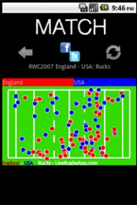
The reason is, as most of you know already, I’ve been developing and launching a mobile app. LiveRugby, inspired by the awesome work made by Colm on his TotalFootball and StatsZone apps, promises to be the definitive way to generate and share graphical analysis and statistics for the data-centric rugby fan during the next World Cup. I chose an app about rugby because is something I understand and I’m passionate about. I wanted to learn more about rugby, and more about mobile applications, and this seemed the best opportunity.

I still can’t say much as many information are, in a way, “secret” until and I need to get some clearance from one of the suppliers. But, I promise, I’ll be writing soon about it.
For the moment, let me just give you a list of what I wanted to experiment with this venture:

  • Planning the application
  • Dealing with the supplier of data, OptaSports
  • Being able to project manage myself
  • Research what kind of statistics might be useful in a sport like rugby and how to display them in a way that is easy to understand to the average fan
  • Develop a full application on my own
  • Being able to outsource part of the artwork to a graphic designer
  • Launch the app on the market
  • Start a marketing campaign on my own getting in touch with press and media
  • Communicating and satisfying customers-users

At the moment the app is launched on the Android market, although I’m already working for an iPhone version for the RBS 6 Nations. Of course, a business venture like this is successful when a profit is made out of it.
However, there are several other measures of success that I need to take in account, roughly at every point of this list.

Whether this project has been a success or not will be subject to analysis and to a more detailed blog post when it will be time to make a balance. For the moment, I’m totally enjoying the learning experience it has been so far, and the constant challenge posed by launching your own enterprise.

I’d like to know what my readers think 🙂

Categories
HCI my projects Web 2.0 Work in IT

Aggregated values on a Google Map

UPDATE 27/08/09: The functionalities of my version of MarkerClusterer have been included in the official Google code project, you can find it gmaps-utility-library-dev. The most interesting part was the so called MarkerClusterer.

Imagine you need to show thousands of markers on a map. There may be many reasons for doing so, for example temperature data, unemployment distributions, and the like. You want to have a precise view, hence the need for a marker in every town or borough. What Xiaoxi and other developed, is a marker able to group all the markers in a certain area. This is a MarkerClusterer. Your map gets split into clusters (of which you can specify the size – but hopefully more fine grained ways of defining areas will be made available) and you show for every cluster a single marker, which is labelled with the total count of markers in that cluster.

I thought that this opened a way to get something more precise and able to make reasoning over map data. Once you have a ClusterMarker, wouldn’t it be wonderful if you had the possibility of displaying some other data on it, rather than the simple count? For example, in the temperatures distribution case, I would be interested in seeing the average temperature of the cluster.

That’s why I developed this fork of the original class (but I’ve applied to get it into the main project – finger crossed!) that allows you to do what follows:

  • create a set of values to tag the locations (so that you technically attach a value to each marker)
  • define a function that is able to return an aggregate value upon the values you passed, automatically for each cluster

That’s all. The result is very simple, but I believe it is a good way to start thinking about how the visualization of distributed data may affect the usability of a map and the understanding of information it carries. Here’s a snapshot of the two versions, the old on the left (bearing just the count) and the new on the right (with average data). Data here refer to NHS Hospital Death Rates, as published on here. If you want to see the full map relating to this example, click here.