Playing With Gpx Data from Strava
I’ve been wanting to try using gpx data for a while. You can record your runs with a variety of apps, and even edit those with a text editor, as gpx is a format that is relatively human-readable. What I realised, though, is that I’d been using Strava quite a lot when we were in lockdown in 2020, my hour of daily air being, often, a jog. Personal best after personal best (which didn’t take much, as I’d never really been a runner before) I got to know areas close to where I lived that were suitable for running, and also venturing for longer runs, including some over 10k.
So, here’s three visualizations for you:
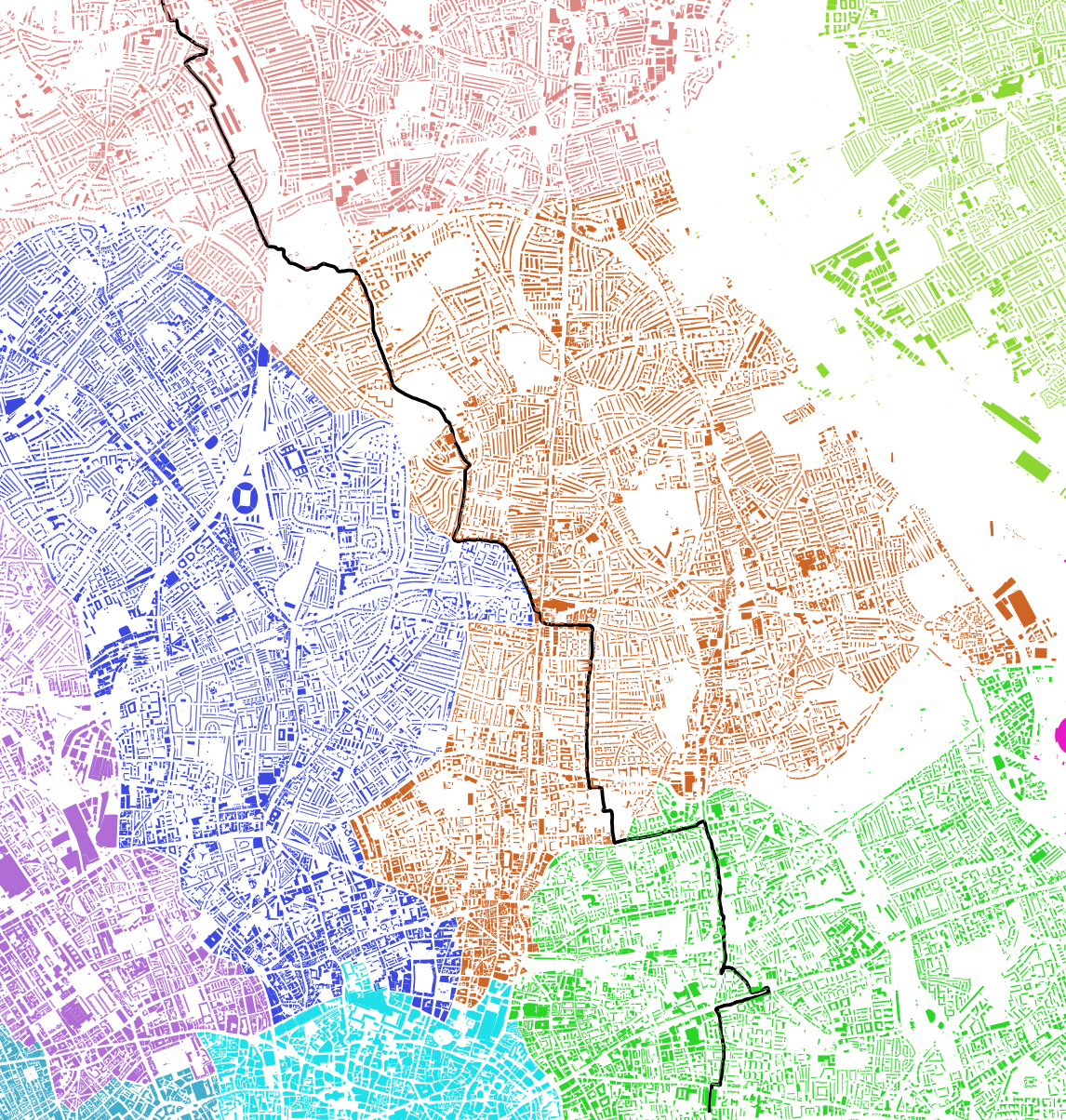
- the first is my longest ever run, and it’s visualized using QGIS on a bakground of a map of buildings, coloured by local authority boundaries
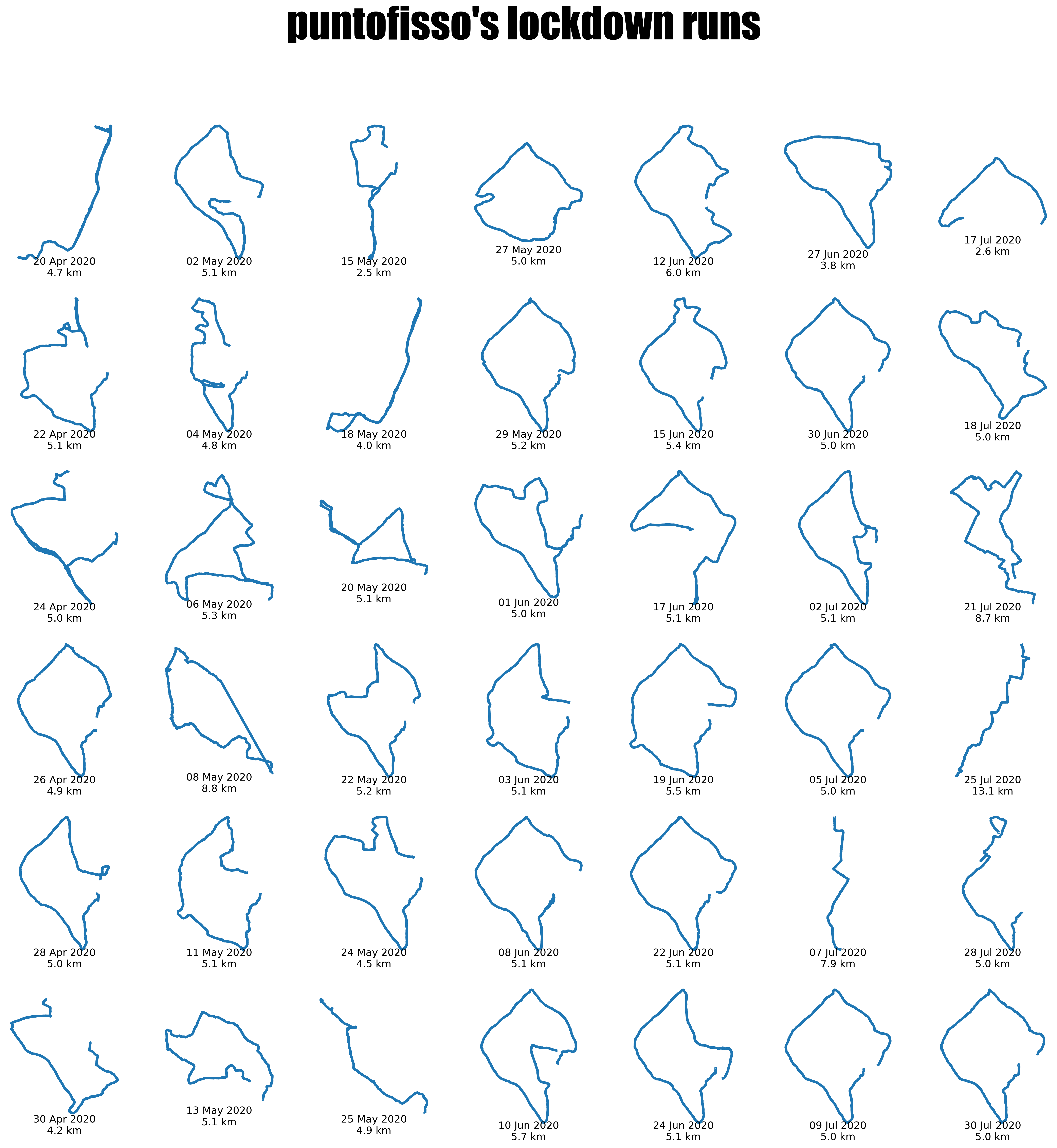
- the second is a grid of what I describe as “lockdown runs”, covering May-July 2020 (so not all were during the strictes of lockdowns), using pyplot in a jupyter notebook
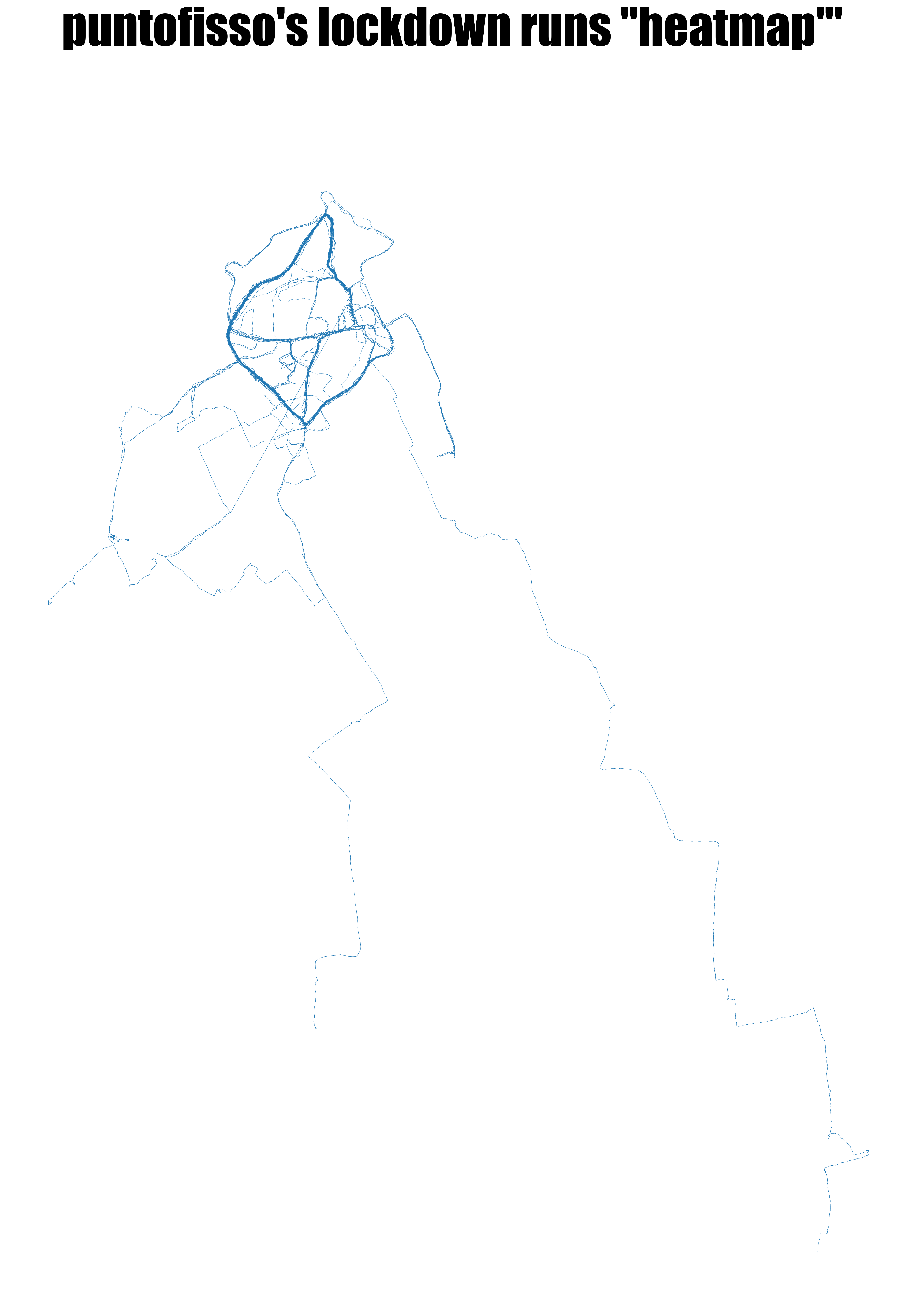
- the third is a “false heatmap” – I simply overlay all the maps so that the stretches I’ve jogged more frequently will appear darker; this, toos, uses pyplot in the same jupyter notebook.
Here’s a few ideas on how to re-create the maps once you have the data from Strava.
My longest run on a bakground of buildings
Technically, the bakground can be described as a figure-ground diagram, and it’s often used by urbanists to display the relationship between built and unbuilt space. In this case, I decided to colour the building according to which local authority they belong to, which required some processing on QGIS.
First of all, it requires just three files:
- the “building” layer from OpenStreetMap; there are multiple ways to obtain this, but the easiset for me was to download the Greater London data from Geofabrik, and import the buildings shapefile into QGIS
- a shapefile containing the boundaries of London’s local authorities; for example, one is provided by the London Data Store.
- the individual gpx file with the run you want to display.

The idea to recreate the map is relatively easy:
- import all files into QGIS as separate layers and make sure they use the same projection and CRS
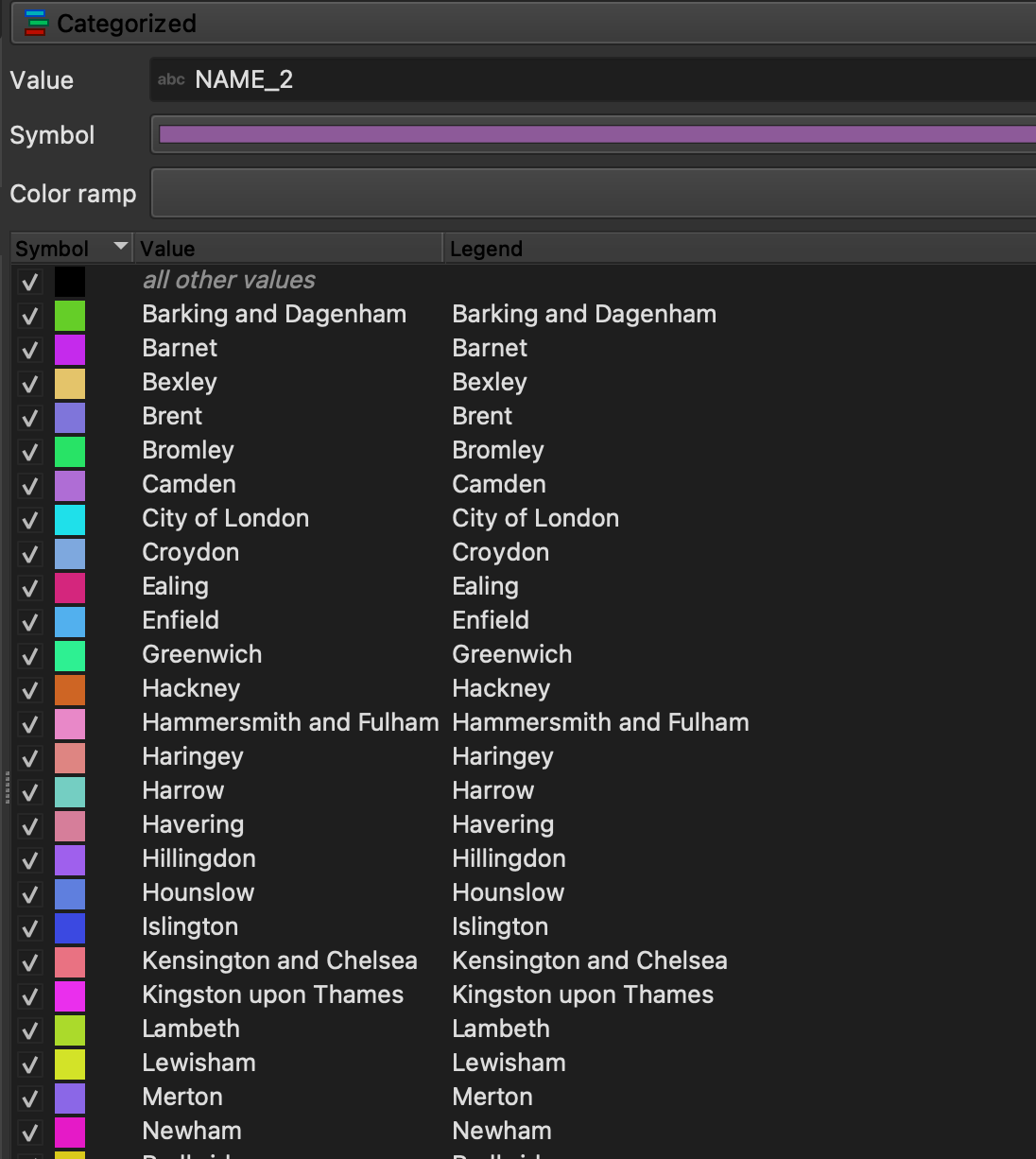
- as the buildings layer needs to be coloured with a “Categorized color ramp” by local authority; however, the buildings shapefile does not contain a field to indicate the local authority. This is where the boundary layer we’ve loaded separately comes to help. What we do is to create a new, joined layer, by using QGIS’s geoprocessing tools. Specifically, from the “Processing Toolbox” we select “Join attributes by location” and follow the instructions. The gist is that we indicate which fields we want to get in the joined layer (in our case it matters the we bring the name or the code of the local authority), and we select the right geometric predicate to make the matching. I will not indicate this in full, it’s good exercise to try and understand the differences between, say, a “contain” and “intersect” relationship.
Once we’ve done this, we can simply have fun by styling the map and creating a layout in the layout manager.

A grid of all my runs
In fact, this was my starting point for the whole train of thoughts. I wanted to write a functions to create grids of plots parametrically, in a way that works with multiple plot types in just a few lines of code. The full jupyter notebook is here on my GitHub and it’s relatively well commented (let me know if you want me to add anything).
Strava downloads come with a handy csv with the list of all activities. So I use this as a master, but if you use a different app, or one that doesn’t have a summary csv, you can easily create your own in a spreadsheet. All you really need is a unique ID and a link to the file, and anything else (distance, etc) is useful but not required to implement the basic display of plots in a grid.
The jupyter notebook will show how to process the gpx file using pandas and geopandas. Let me just explain my thinking behind the grid.
The idea is to create a matplotlib figure made of subplots. You can configure each subplot exactly as if it was an individual plot. The subplots are represented by axes. You can think of axes like cartesian axes, although they start at (0,0) in the top left and what would normally be the y axis goes down rather than up.
Fundamentally, we create a fig of columns x rows – it is important to make sure that the value of columns and rows is the same or higher of the number of plots we’re trying to display, or this will mess up with the figure. Obviously, I could have checked for this in the code, but there’s a degree of manual intervention required as I prefer to check things from an esthetic point of view.
Some relevant code excerpts follow.
This bit configures the plot and makes sure it is as big as it can be on the screen:
columns=6
rows=7

px = 1/plt.rcParams['figure.dpi']  # pixel in inches
fig, axs = plt.subplots(columns, rows ,figsize=(1800*px, 1800*px))
fig.tight_layout()
This sets up the iteration over the activities and identify with axes we’re referring to. Once again, we’re iterating on a bidimensional grid, starting at (0,0) and progressing to (columns-1, rows-1):
i = 0
j = 0

for index, row in activities_lockdown.iterrows():

    # select the file for each activity
    file = "strava/activities/" + str(row['Activity ID']) + ".gpx"
    gdf = gpd.read_file(file, layer='tracks')

    # Settings of each plot in the grid, by passing axes
    thisax = axs[i,j]
    gdf.plot( ax=thisax, linewidth=3 )

    # Modulo math to make sure we're in the right slot
    i = ( i + 1 )
    if (i % columns )  == 0:
        j = ( j + 1 )
        i = 0
        if (j % rows) == 0:
            j = 0
The key thing to understand is that gdf.plot() doesn’t directly display the plot, but it adds it to the figure, in the position determined by thisax = axs[i,j]. The actual dispaying is made by the final plt.show() (and, in our case, by plt.savefig(), which saves the plot to a file).

The heatmaps of all runs
Now, this is not, strictly speaking, a heatmap – there is certainly a mathematical way to calculate it so that each segment is analysed and redrawn, and there’s a variety of frameworks that do this. However, I couldn’t find a way to do this as simply as possible in jupyter, and I realised that the easiest of the easy way would be to simply superimpose all the chart one over each other.
The code here cheats a little and just reuses the previous code by creating a “grid” 1x1 (i.e. one single plot). So the code just overlays the various plots transparently on the same axis, over and over again. It’s obviously not perfect, but it does the job.
