Making a map of the closest capital using QGIS
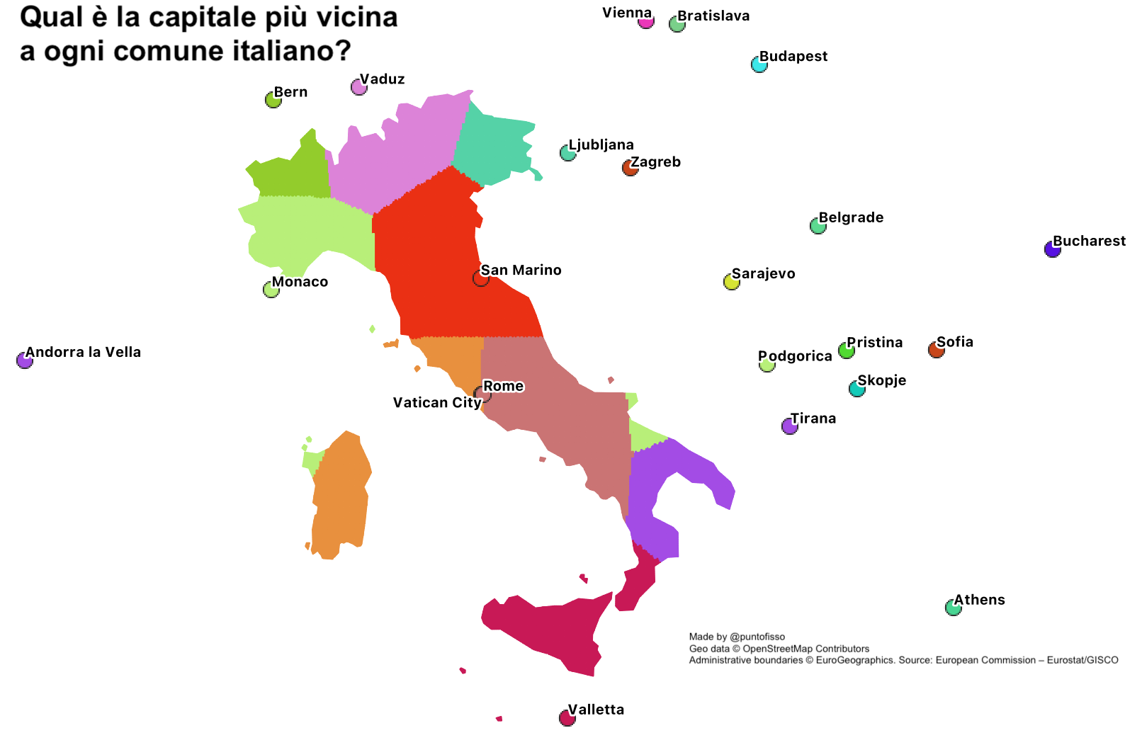
I saw this map on Facebook. It asks what capitals are closest to each Italian town, creating what looks like a continuous map to display the result. I like this kind of thing, so I set out to replicate it using QGIS, and making the process as replicable as possible.

The TL;DR is as follows
- I first got the data and boundaries
- I found a formula to calculate the closest capital by distance
- I found a way to apply a parametric colouring to the map.
In fact, I did this first by using colouring by province. This is because I am familiar with polygons and how to apply colouring to them, even parametrically. But this wasn’t the intended final result, which is at a much closer level. In order to achieve a quasi-replica of the Facebook map, I ended up creating a 5km-grid the same shape as Italy, then colouring each element of the grid using the same function.
Here’s the final result and how to reproduce it, step-by-step.
1. Preparing the data
In terms of data, there are fundamentally two assets needed:
- a table of capitals and their respective location
- a shape of the borders of the area you want to make the calculation for.
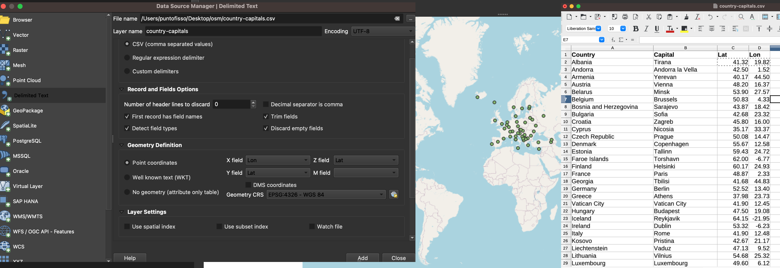
In my case, I had a csv of European capitals (I think coming from OpenStreetMap), so I decided to use it. For the borders, I used the shapefile of NUTS areas provided by the European Commission, but any similar will do.
First, import the csv file as “delimited text data”. I called this layer capitals. If you have prepared the dataset in a spreadsheet and saved as csv (as I show on the image on the right) the data won’t need much cleaning, but it does help to display it on a map, for example by adding a Open Street Map layer (e.g. Web > QuickMapServices > OpenStreetMap, if you have installed the QuickMapServices plugin), to make sure that the data is correct.
The shapefile will be Eurostat-wide, so you will want to filter it for one country. You do this by right-clicking on the layer and selecting “Filter”. As discussed, my first attempt will be colouring small areas according to the closes capital. We do this at a province-level, which corresponds to NUTS level 3. In the formula field, enter
``“LEVL_CODE” = ‘3’ AND “CNTR_CODE” = ‘IT’."CNTR_CODE" = 'IT'.
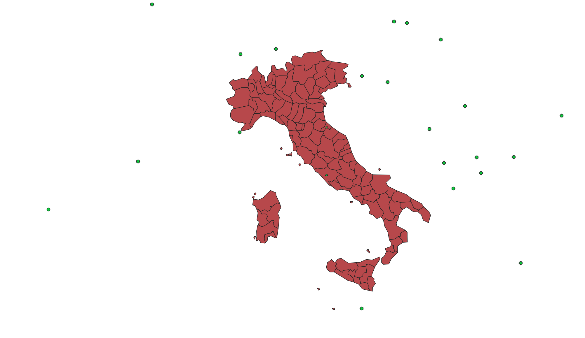
The result, once you remove the OpenStreetMap layer, is as follows: the boundaries of Italy and its provinces and the dots representing each capital.
2. Setting the colouring by polygon
As I said, the most intuitive way to colour a map is to set up a parametric colouring for each polygon (i.e. each province) that corresponds to the colour of each capital. In order to achieve this, we’ll do two things:
- First, we will set up a colour for each capital dot in the capitals layer
- We’ll then tell the polygons layer to colour according to the nearest capital by using one of QGIS built-in.
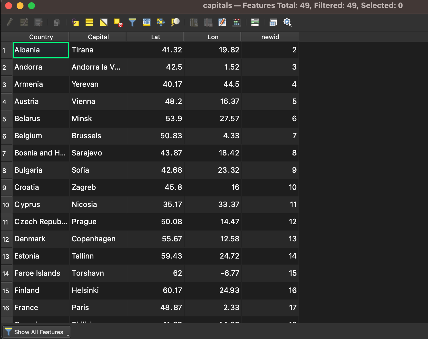
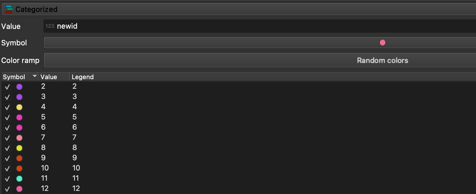
The first step is relatively easy, but there is something to be aware of. Basically, if you are familiar with QGIS you might be tempted to simply use the built-in feature ID to assign random colours to each capital dot. This will work, but as reported on these two StackExchange thread 1 and 2, for some reasons that I can’t quite work out this will confuse the formula when we do the polygon colouring. In order to get around this issue, I simply created a new field called newid and assigned it the $id value (which, interestingly, seems to assign an increment of one with respect to the row index).
We can now assign categorised random colours to the dots in the layer properties.
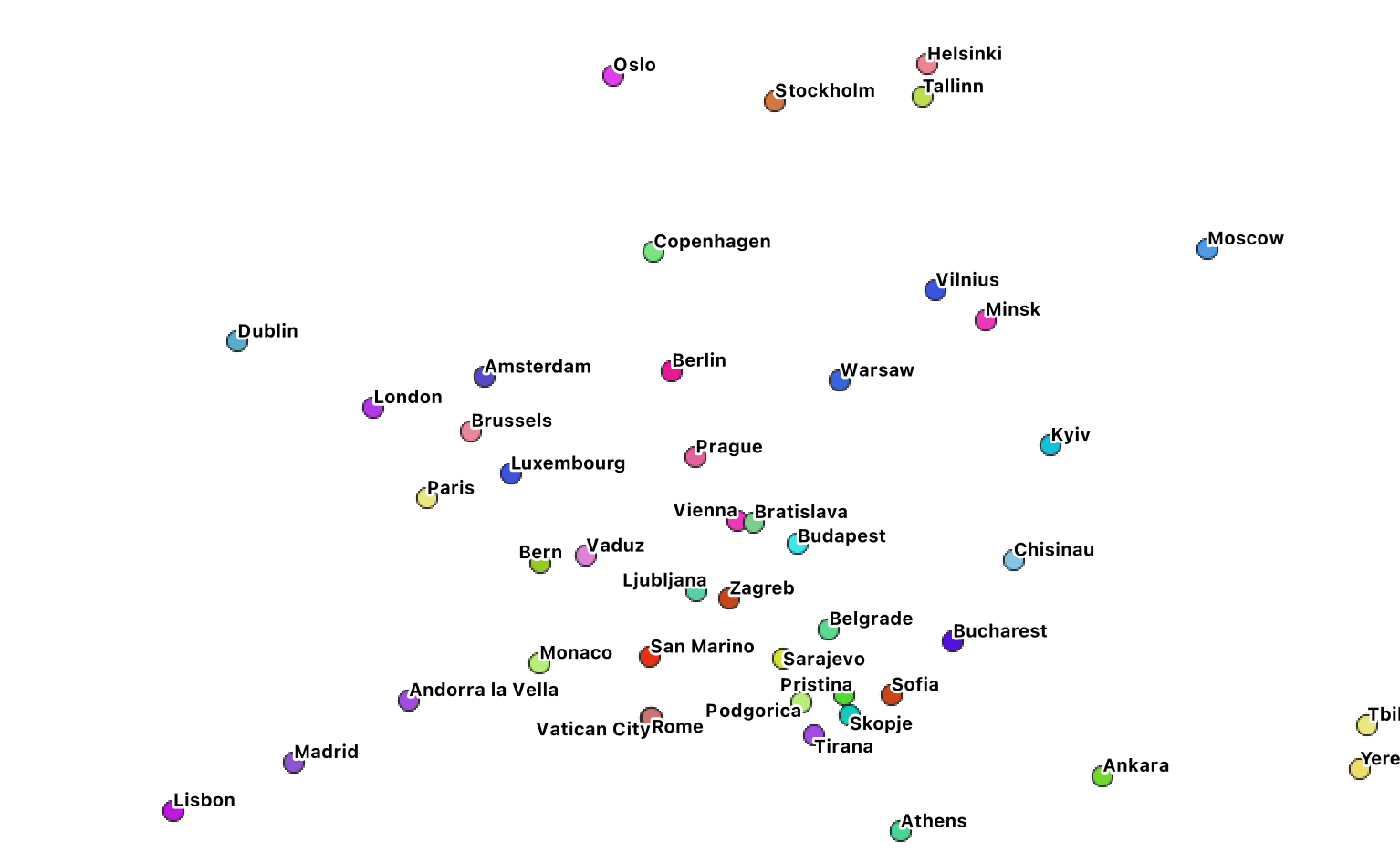
This is what it could look like, with added labels.
 .
.
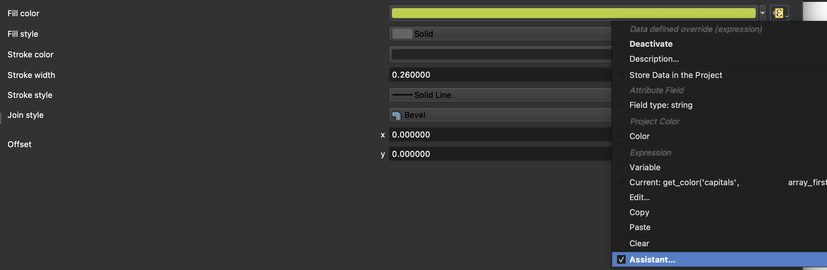
We can now move onto step 2, and assign the colouring to the polygons in the NUTS 3 layer. This will make use of the overlay_nearest() function in QGIS, which returns, for a given layer, the IDs of the features that are nearest to it in another layer. As this returns an array, you will then pass the results of overlay_nearest() to array_first() as you’re only interested in the individual nearest point. Once this is done, all it takes for the colouring to happen is to query the renderer to get that point ID’s corresponding colour. There are several ways of doing it, but the simples one is to define in the function editor a get_colour() function with two parametres: a layer name and a feature ID. The function will return the RGB tuple (including transparency level). An easy implementation of the get_colour() function is in the StackExchange thread above, and it’s reported below for ease.
get_colour('capitals', array_first ( overlay_nearest('capitals', $id ) ) +1 )
The +1 is because of the mismatch between $id (the feature’s internal ID) and newid (the calculated attribute I added). This function needs to be added with the “Assistant” in the Expression Editor. When set up, the epsilon sign will turn yellow as shown in the picture. You can use the expression editor to do some simple debugging.
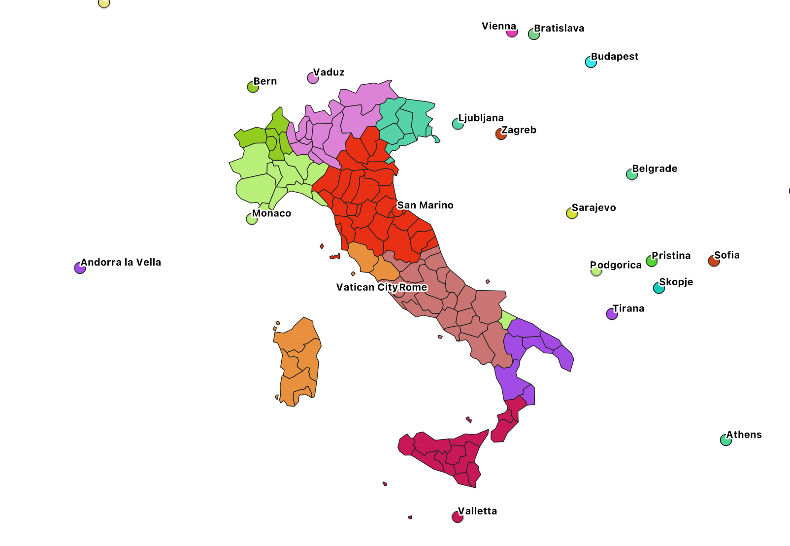
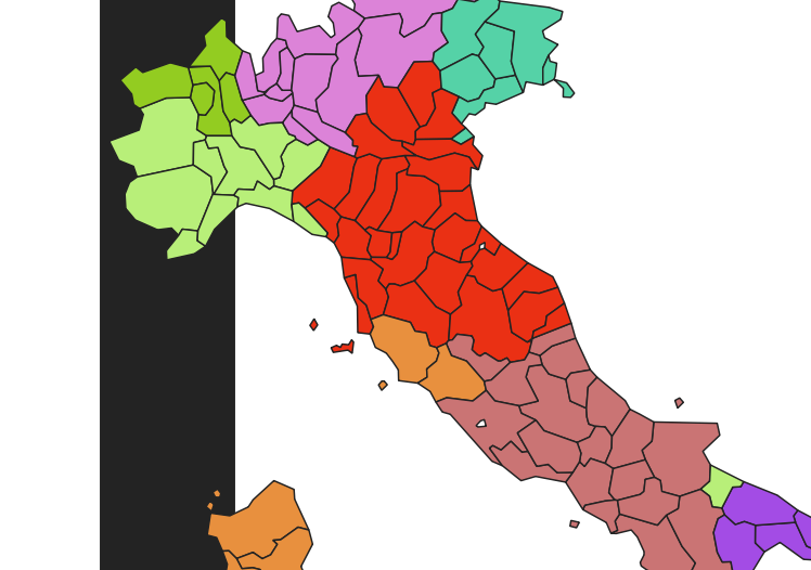
The result is a map that looks like the below.
3. Creating a grid and overlaying it with the shapefile
Now, this is of course not the ideal reproduction of our initial map, as it’s proxying the closeness at a province level, assigning to every town in the province the closest capital to the centroid of the province. If we want a more accurate map, the easiest way that I can think of is to create a grid with small-enough cells to give an idea of continuity, and colour each cell in the grid with the same formula we’ve seen above.
The first step is to re-filter our NUTS level 3 layer to only show the national boundaries, which are NUTS level 0. The filtering formula becomes:
"LEVL_CODE" = '0' AND "CNTR_CODE" = 'IT'.
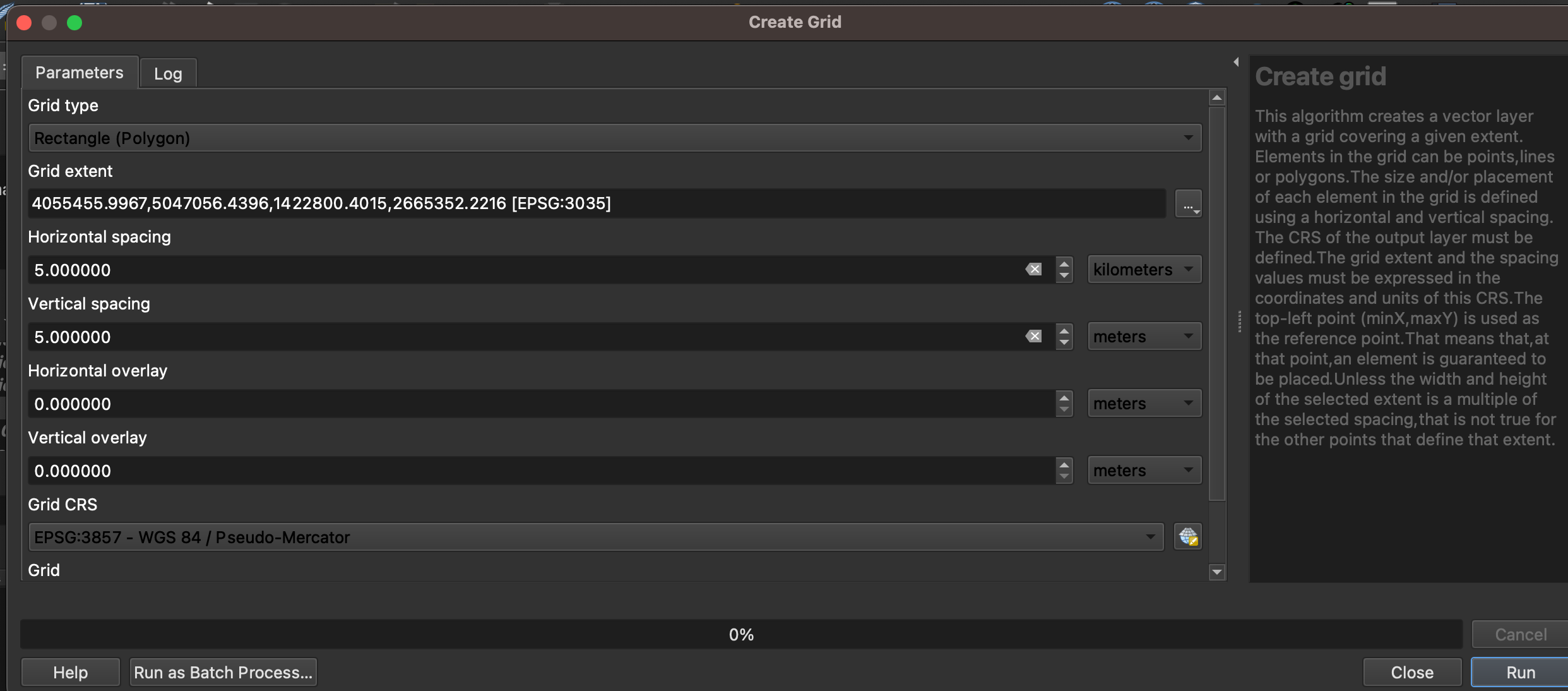
Then we create the grid by using Vector > Research Tools > Create Grid… There are many ways of creating a grid that works for you. I went for rectangles of 5km x 5km, which kinda works for the memory I have on my laptop, using the country layer to set up the extent automatically.
The result is not fully shown here, but you will see that QGIS will start drawing a grid that will probably obscure most of your map. Don’t care too much about this, because we’ll soon get into the next step.
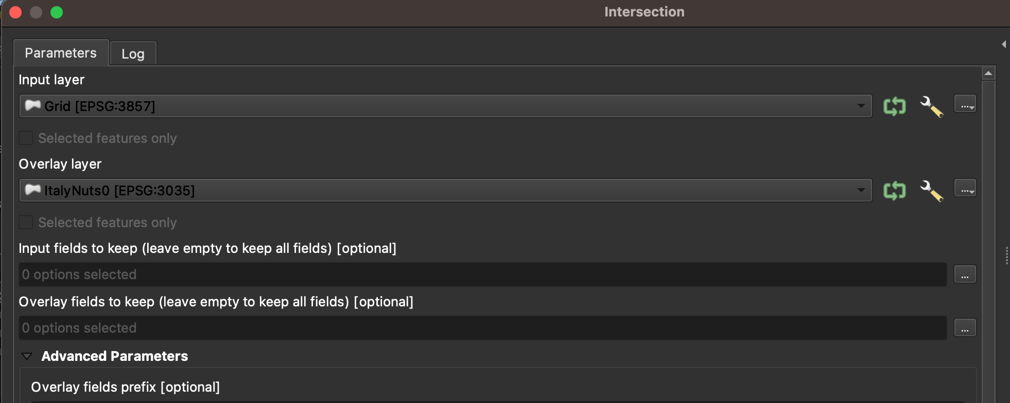
What we want is for the grid to only overlay the boundaries of Italy. In order to do so, we will simply calculate an intersection using the QGIS Geoprocessing Tools > Intersection menu item and selecting the grid layer as our input and the filtered boundaries of Italy as output. The process will create a new intersection layer, which is the one that we’ll colour.
4. Final colouring and settings
Once the intersection is done, the colouring will be easy – we’ll just reapply the same formula to the fill. Pay attention, however, to the fact that this is a grid: if you want smooth results that don’t show the grid itself, you’ll need to apply the formula both to the fill colour and the stroke colour. I found that the version of QGIS is a little buggy – sometimes it won’t apply the function, so I had to try three or four times before it worked.
Here’s, again, our final result.
Can you help?
There are a two things I can’t quite understand or get right, and if you’re an expert of QGIS I’d really appreciate your help.
First, is this the best way to achieve what I’ve done or is there a simpler way to colour the map without having to use a grid?
Secondly, why does it not work if I try and use the feature ID directly in order to colour the capital layer? Is it a bug? This was, once again, reported on StackExchange but it sounds too odd a behaviour not to have a reason.
Appendix - the get_colour()function
   # Get all layers
    layers_names = []
    for ll in QgsProject.instance().mapLayers().values():
        if ll.name() == layer or ll.id() == layer:
            layer1 = ll

    # set up an iterator over the layer's features
    iterator = layer1.getFeatures(QgsFeatureRequest().setFilterFid(uid))
    feature = next(iterator)
    color = [0,0,0,0]

    # The function works for singleSymbol, graduatedSymbol and categorizedSymbol colour schemes
    if layer1.renderer().type() =='singleSymbol':
        rgb = layer1.renderer().symbol().color().getRgb()
        color = '{},{},{},{}'.format(rgb[0],rgb[1],rgb[2],rgb[3])

    if layer1.renderer().type() == 'graduatedSymbol':
        for range in layer1.renderer().ranges:
            attribute = layer1.renderer().classAttribute()
            value = feature.attribute(attribute)
            return value
            if range.upperValue() > range and range.lowerValue() < range:
                rgb = range.symbol().color().getRgb()
                color = '{},{},{},{}'.format(rgb[0],rgb[1],rgb[2],rgb[3])

    if layer1.renderer().type() == 'categorizedSymbol':
        attribute = layer1.renderer().classAttribute()
        value = feature.attribute(attribute)
        catValues = []
        for cat in layer1.renderer().categories():
            if type(cat.value()) != QVariant:
                if int(cat.value()) == value:
                    rgb = cat.symbol().color().getRgb()
                    color = '{},{},{},{}'.format(rgb[0],rgb[1],rgb[2],rgb[3])

    return color