All I Want For Christmas Is Davos
I bumped into this nice visualization of Google Trends. It’s about web searches for “Davos”, which clearly exhibit a seasonal pattern consisten with the dates of the World Economic Forum.
…Using a M5AtomS3R to display live bus arrival info

I’ve been meaning to play with microcontrollers for a long time. When I was at university, I was really jealous of my friends who had studied electronics in high school and were able to use these mysterious devices. The learning curve was really hard before ESP32 and Arduino made things much more standard and easy. The latter, especially, came with an IDE that, over time, has become the de facto standard not just for the Arduino family of devices, but also for a range of others, supported by installing external libraries.
…The Bus Station That Didn’t Exist, and Other Data Epiphanies
This article was first published in Nightingale

“Data is multidisciplinary” is my mantra—it’s 2025, and I’ve now worked 20 years in every possible flavour of data—data visualization, open data advocacy, data pipelines in healthcare, data-driven national-scale services, AI innovation, and more. Whatever the application or project, my take on data literacy is the fundamental ability to challenge your own assumptions about the data you have or don’t, the appropriateness in using it, the ethics of your application, and ask yourself: is there a different way, perhaps? Here is a gallery of some of my most treasured eureka moments working with data.
…Notes from csv,conf,v9
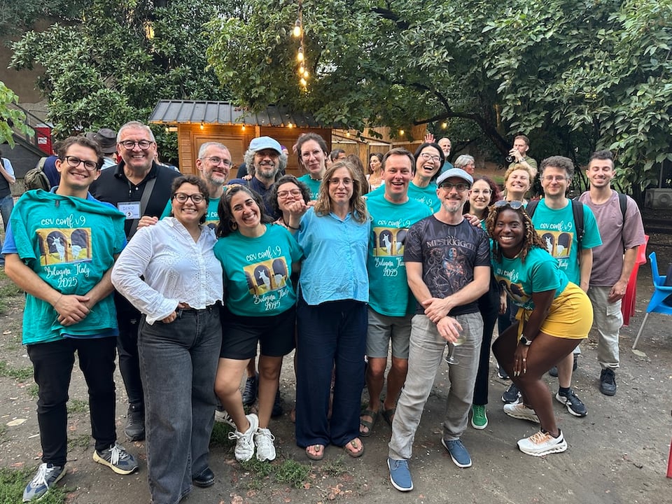
I’ve just come back from a splendid week in Bologna, where I helped run csv,conf,v9 for the first time.
…Commutes within urban areas are the shortest
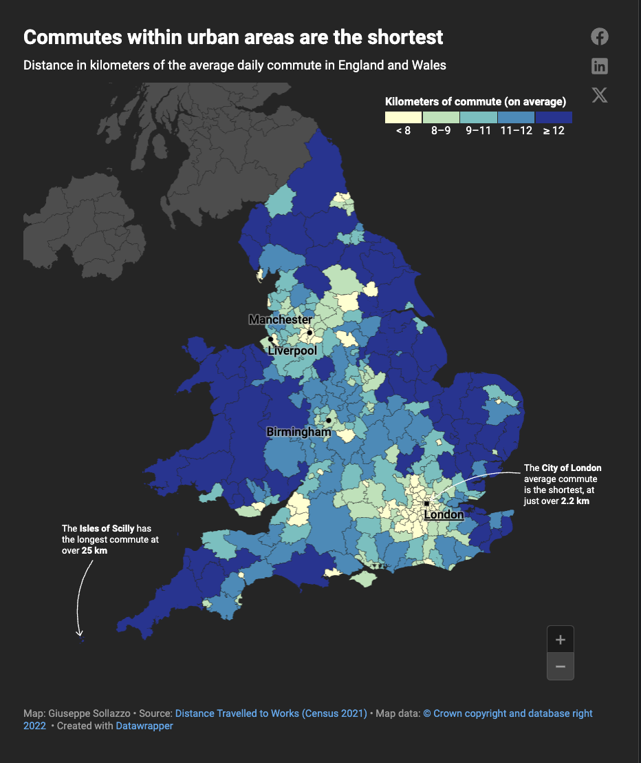
A couple of weeks ago I saw this interesting map of commute times in Germany made by Datawrapper’s co-CEO David Kokkelink, noting how commutes into major cities are the longest in Germany.
…The Open Data Delusion
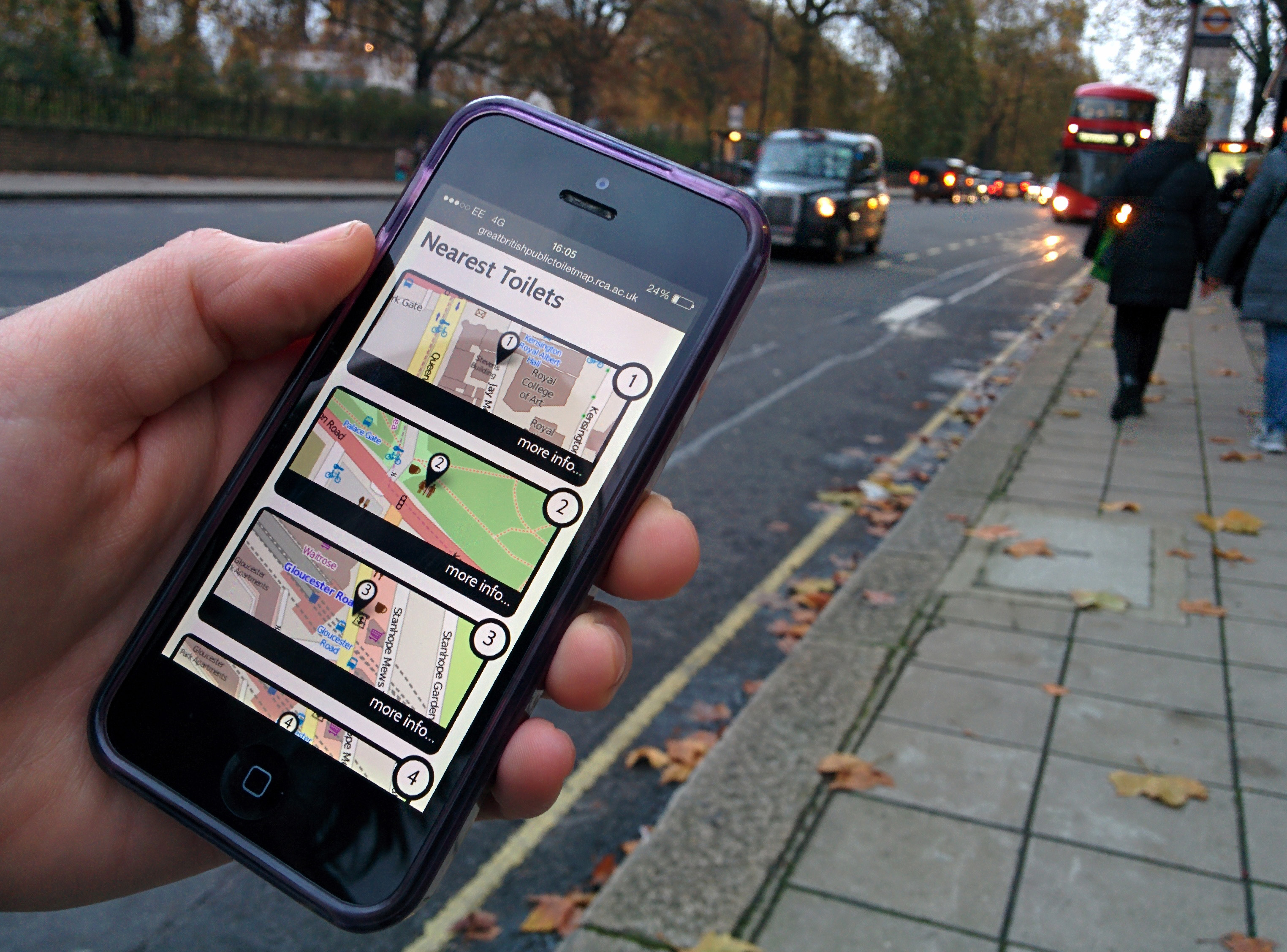 Photograph: The Helen Hamlyn Centre for Design
Open Data is about the “Data” as much as it is about the “Open.” Some stories from my experience as an Open Data activist and adviser illustrate it.
…QGIS – An ATLAS of buildings by council

Another little QGIS step-by-step note to my future self.
Prerequisites: This time I was looking to create a visualization of London councils showing the buildings that come from Open Street Map, using the handy downloads from Geofabrik to get the buildings shapefile into QGIS. In order to add the “by council” element, I also downloaded an official shapefile of the boundaries of London councils (e.g. from here) and then joined the two layers using QGIS geoprocessing tools. I’ll leave this to you as exercise, but the final output is a layer with the buildings and a local authority unique ID.
…Playing With Gpx Data from Strava
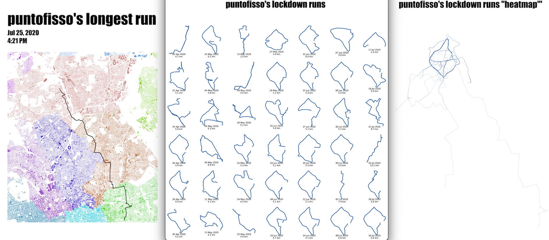
I’ve been wanting to try using gpx data for a while. You can record your runs with a variety of apps, and even edit those with a text editor, as gpx is a format that is relatively human-readable. What I realised, though, is that I’d been using Strava quite a lot when we were in lockdown in 2020, my hour of daily air being, often, a jog. Personal best after personal best (which didn’t take much, as I’d never really been a runner before) I got to know areas close to where I lived that were suitable for running, and also venturing for longer runs, including some over 10k.
…Three things about data...
First published on LinkedIn
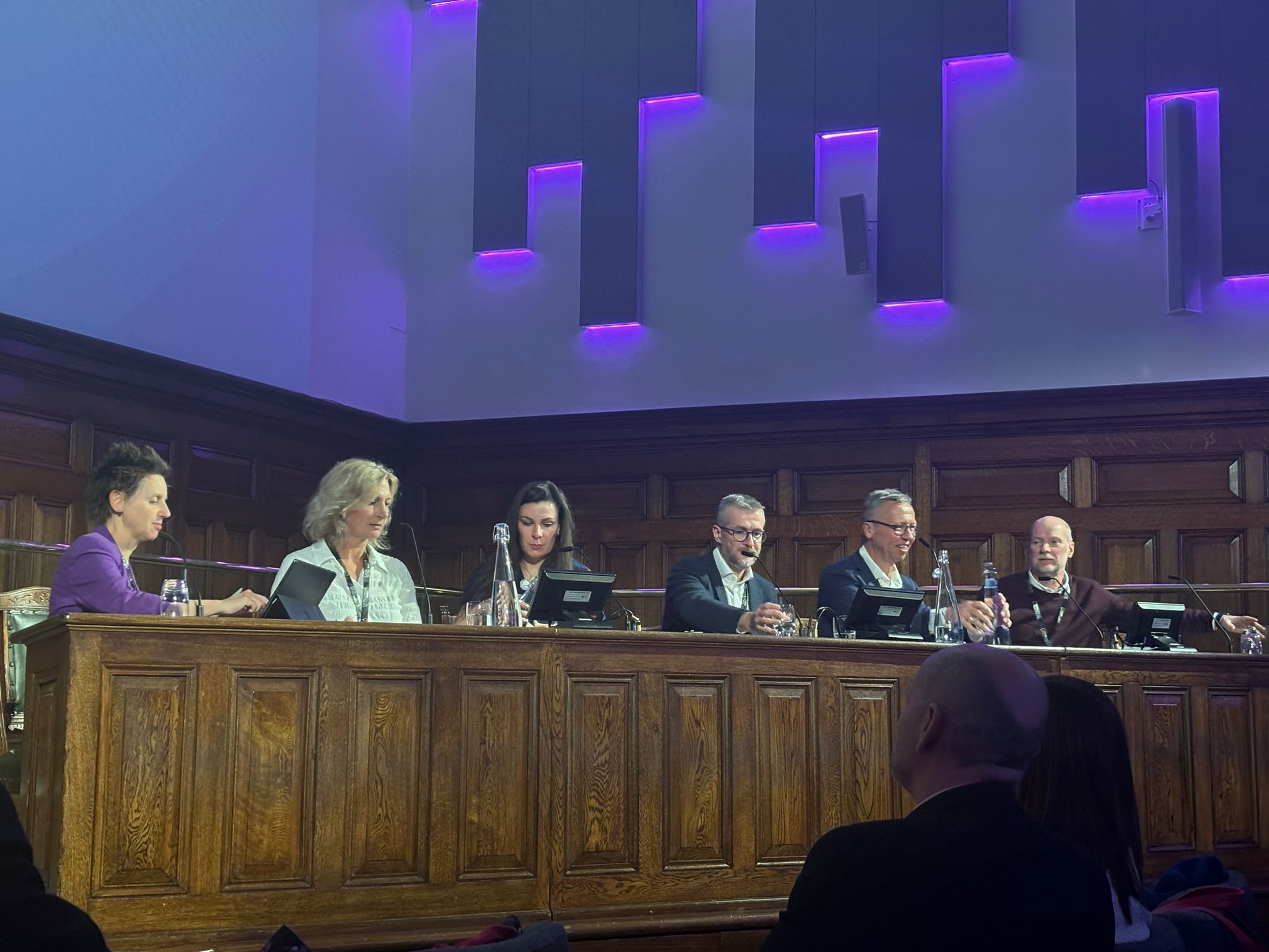
Quite a few interesting discussions at Think Data yesterday, both on and off stage.
…Calculating the average face from a set of photos using OpenCV on Colab
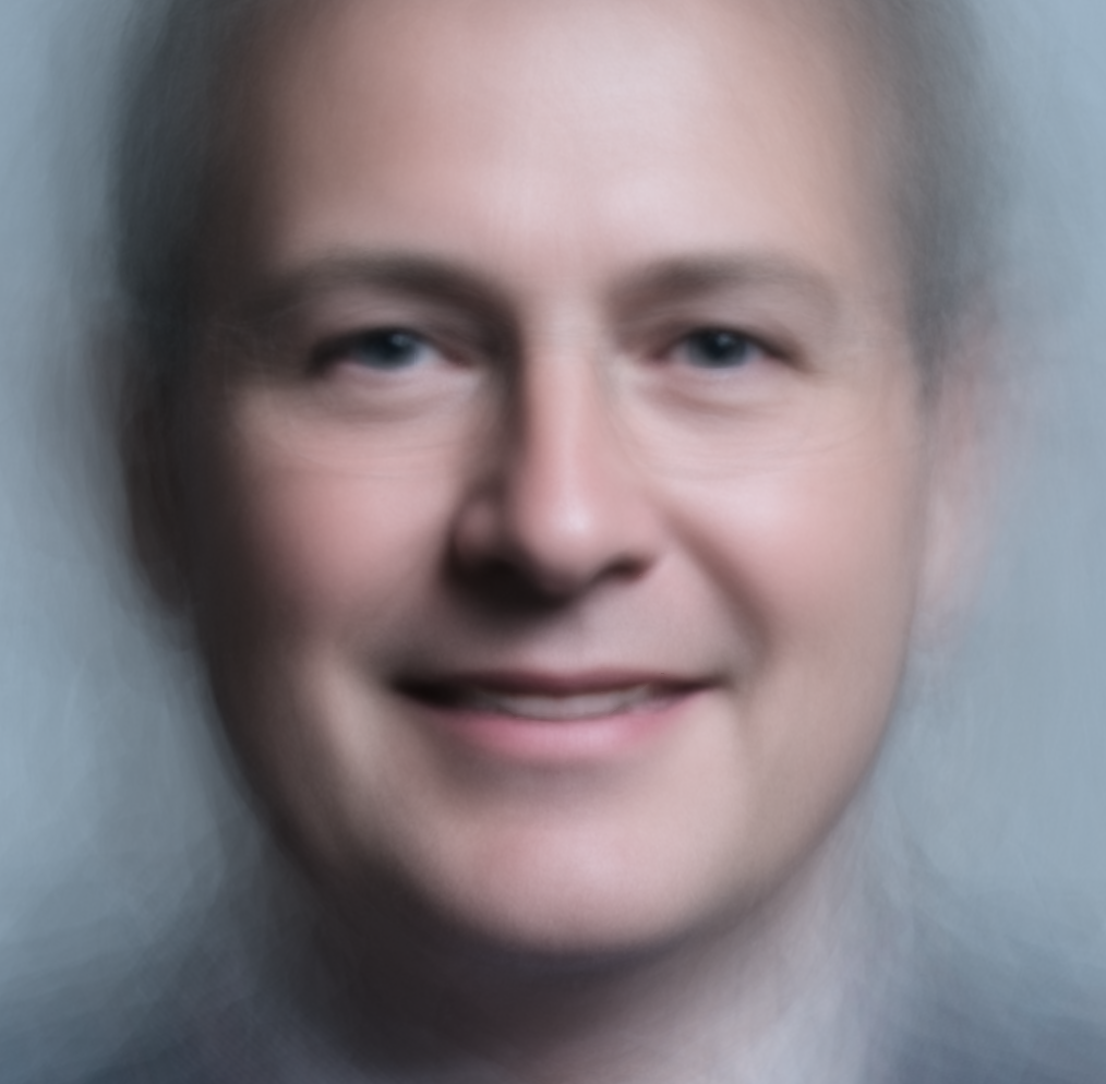
TL;DR Here is the Colab notebook.
A few years back, the the UK Parliament released photo portraits of each Member of Parliament. So, I thought, it would be cool to do something data-driven with that image set. I had worked before with algorithms that allowed to find reference points on a face, using Terence Eden’s code that found the most similar painting to a face.
…